Eleon
Olive oil refers to a Linear B sign from Knossos as erawon “eleon” and to others with a special ideogram. Based on these historical data is the name of the company “Eleon”.
Read moreRead less
ELEON is a family business that produces and bottles olive oil at the foot of Mount Olympus. Its purpose is to offer olive oil unadulterated, as 3,500 years ago, not to interfere in the processes of nature, not to burden the ecosystem with pesticides and chemicals, and to promote the Mediterranean diet to the whole world.
Logo Design
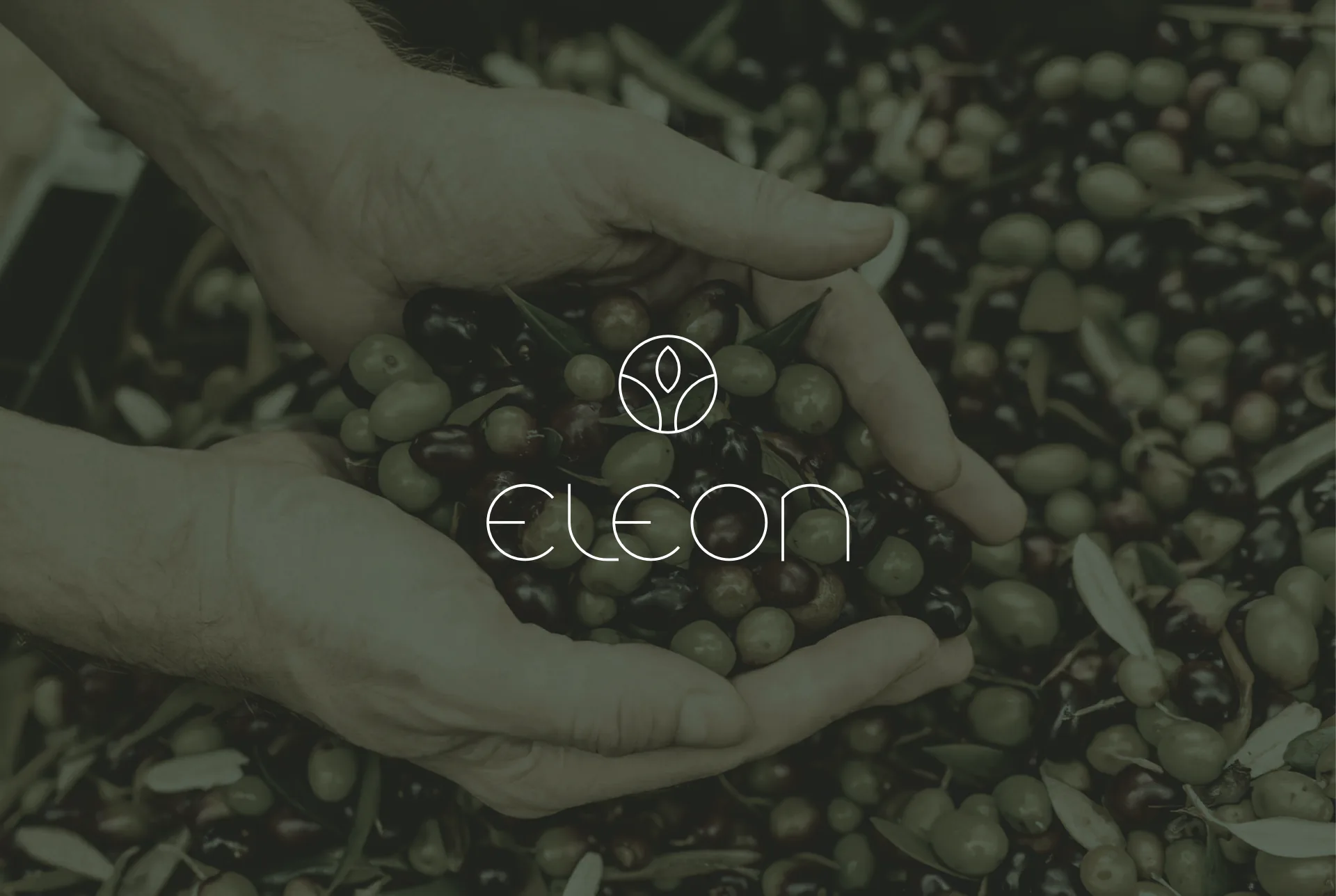
For the design of the logo I relied on the simplest and most perfect geometric shape, the Circle, which represents perfection and completion. The mark consists of the olive fruit on an olive tree, all in a simplified and stylized circle.
Color Palette
As the color that represents the logo and the entire corporate identity I chose a dark olive shade that matches the color of the olive, together with White and Black. White expresses purity, low weight and low fat. Black is formal, elegant and gives prestige.
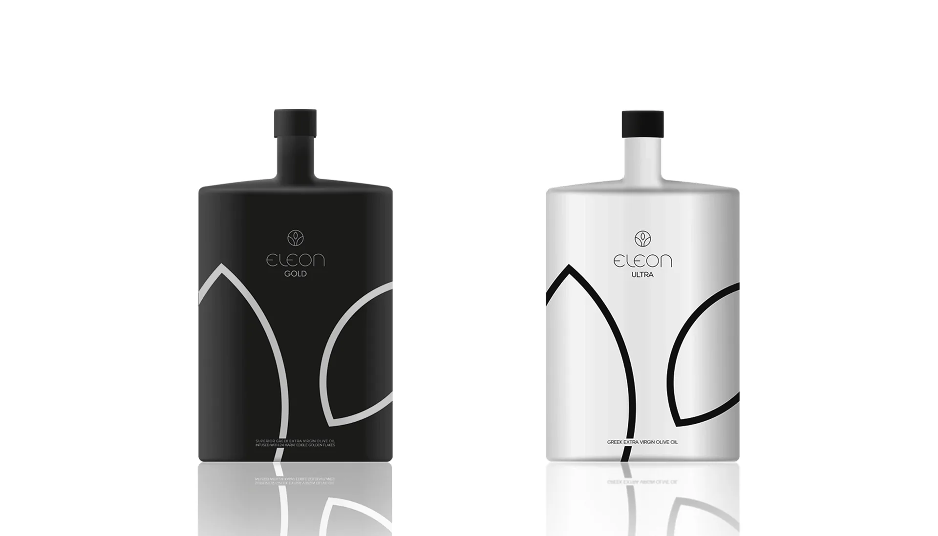
Packaging
ELEON ORGANIC is an excellent virgin olive oil dressed in white for purity. ELEON ULTRA uses a clean, bright white that highlights the clarity of the product. ELEON GOLD, an olive oil with flakes of 24 carat gold, is dressed in black, a color of prestige that symbolizes luxury.
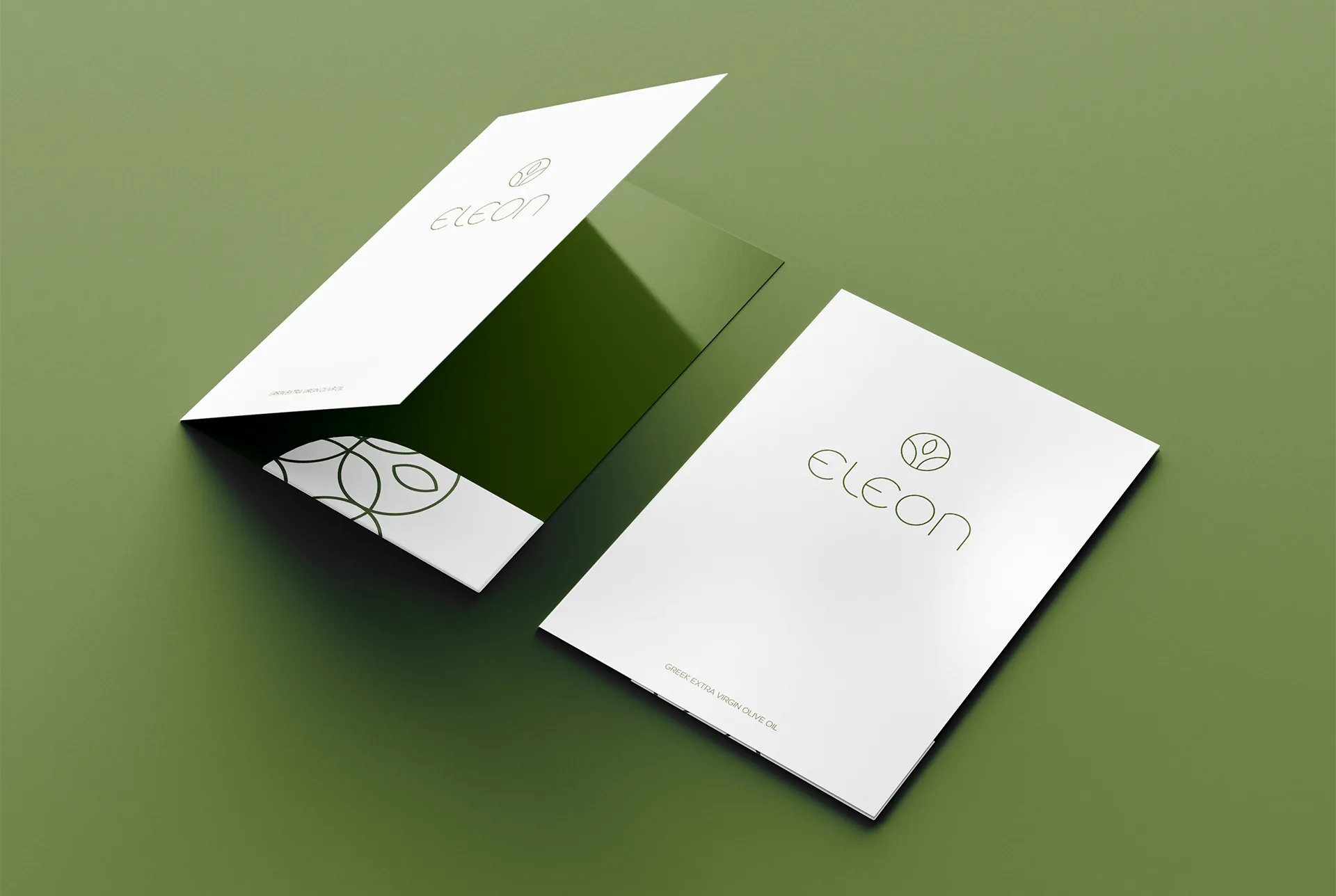
Printed matter
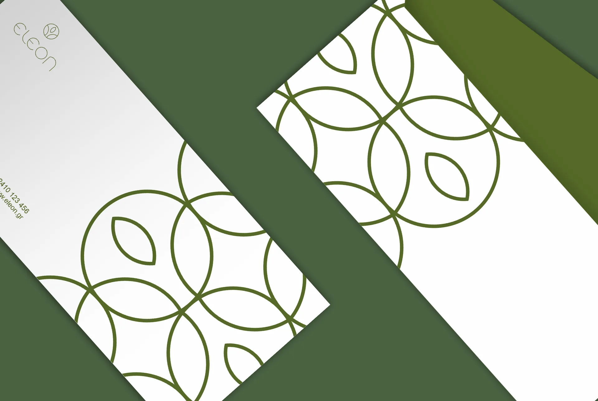
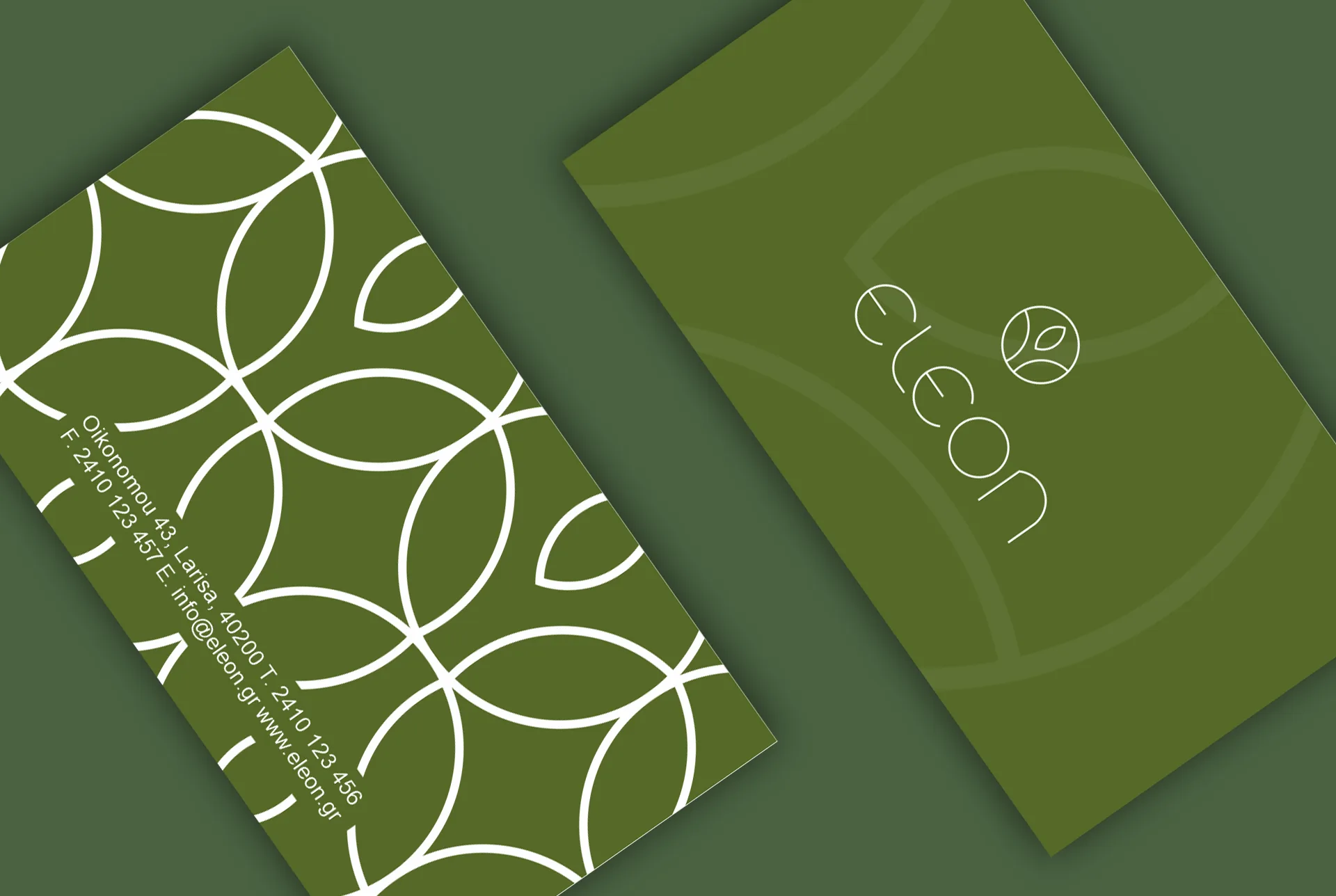
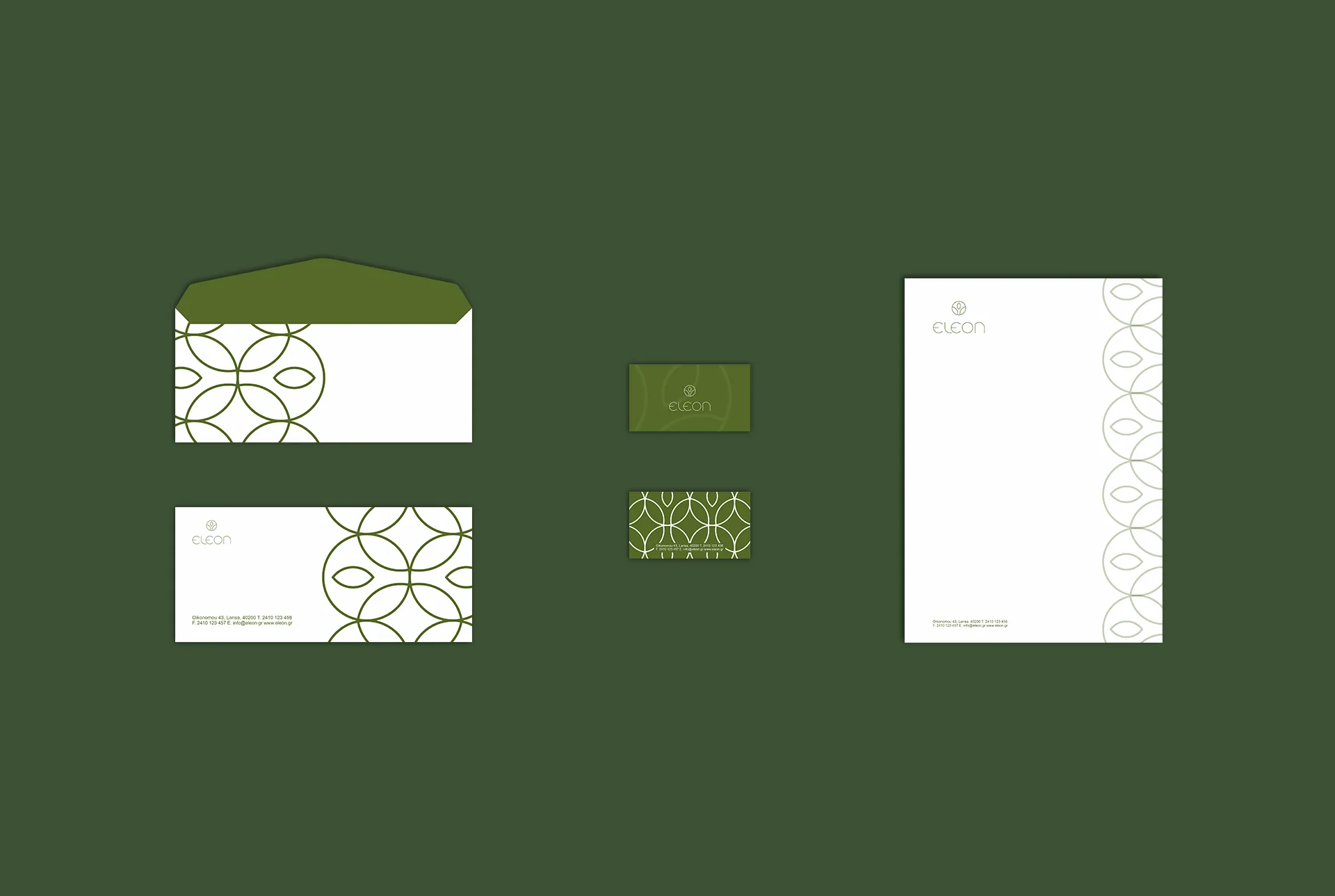
The company’s publications follow the same minimalist design and simplicity, so that its message is easily understood by consumers. This project was my dissertation at the 1st DIEK of Larissa (2019-2021).